
Eclecta Quartet
I was hired by Eclecta Quartet to help rebrand and modernize their website. They wanted to showcase the unique and individual personalities that make up the quartet while also moving away from hyper-feminine branding.

Background
Eclecta Quartet was founded by Shaina Evoniuk to provide live music for a myriad of events. Ms. Evoniuk wanted to create a killer group that would highlight and pay the amazing female musicians in a male dominated industry. As Eclecta continues to grow and evolve it is imperative that the website also include people of fluid and nonconforming gender identities so that the website reflects the values of Eclecta.
Tools: Miro, Whimsical, and Figma.
Role: UX Researcher, UI Designer.
Given Materials: Access to Eclecta Quartet’s Wordpress website.
Deliverables: UI Style Tile, High-Fidelity screen mock-ups, and prototype.
Duration: 80 hours
The Problem
Eclecta Quartet is a modern string collective whose website does not reflect their current brand or values.
The Objective
How might we keep the spirit of Eclecta Quartet while helping them rebrand their website so their values are clear to prospective clients?
Define
I started by interviewing event planners and people who had recently booked vendors for an event so I could get a better idea of what customers are looking for when they book a vendor. I wanted to knew their booking habits and what they considered a trustworthy website to look like.
Interviewees mentioned seeing testimonials made vendors appear much more trustworthy
“If I can’t find the info that I’m looking for in sixty seconds or less I’m probably not going to use that vendor”
High resolution photos introduce potential customers to the members of Eclecta Quartet making the process feel more personal and trustworthy.
After running a competitive analysis on vendors provided by Ms. Evoniuk I was able to parse what the competitor websites had in common and what aligned with interviewee results. About pages, video/audio clips, high-resolution photos, social media links and contact forms were the building blocks of a trustworthy vendor website.
Design
Ms. Evoniuk used the adjectives “powerful” and “classy” to describe the brand which I translated into a serif font style. Using a sans-serif font for the body would help visually define Eclecta as cool while also keeping it approachable. The purple in the color palette helped reflect power while the grey would help the site feel classy. The button edges were kept squared to feel more modern and the photography style would place emphasis on versatility and hipness.

Eclecta’s Style Tile outlines the color palette, button styles, social icons, typography and style inspiration for the brand.

The redesigned home page of Eclecta includes a large hero image of the quartet, a testimonial and a quick introduction to the group.
“From the website I would describe the Eclecta Quartet as edgy, modern, and talented.”

The collective page was redesigned with a hover state so that the different headshot styles would not compete with one another.
Challenges
Creating a website under the constraints of Wordpress was tricky, I had to be mindful of what fonts and layouts were available. When creating my low-fidelity sketches I kept them very simple in case they didn’t work in Wordpress. Learning how to navigate and use a new website builder was also time consuming, I spent more time trying to understand how to use Wordpress than I wanted to.
Lo-fi sketches of the artist collective page.
Another challenge was redesigning the artist page to communicate to potential customers that Eclecta Quartet is made up of more than four musicians. Ms. Evoniuk and I agreed that calling it a “Collective” was the most straightforward language we could use while still reassuring the clients that they would see familiar faces from the website at their event.
The mobile layout of the artist collective page gives a teaser about each musician.
The final challenge was deciding on the best presentation of testimonials. Striking the right balance between informing the potential customer and overwhelming them was a delicate task. It took many iterations of the testimonials page before I felt that it was skim-able but also showcased the variety that Eclecta Quartet was known for.
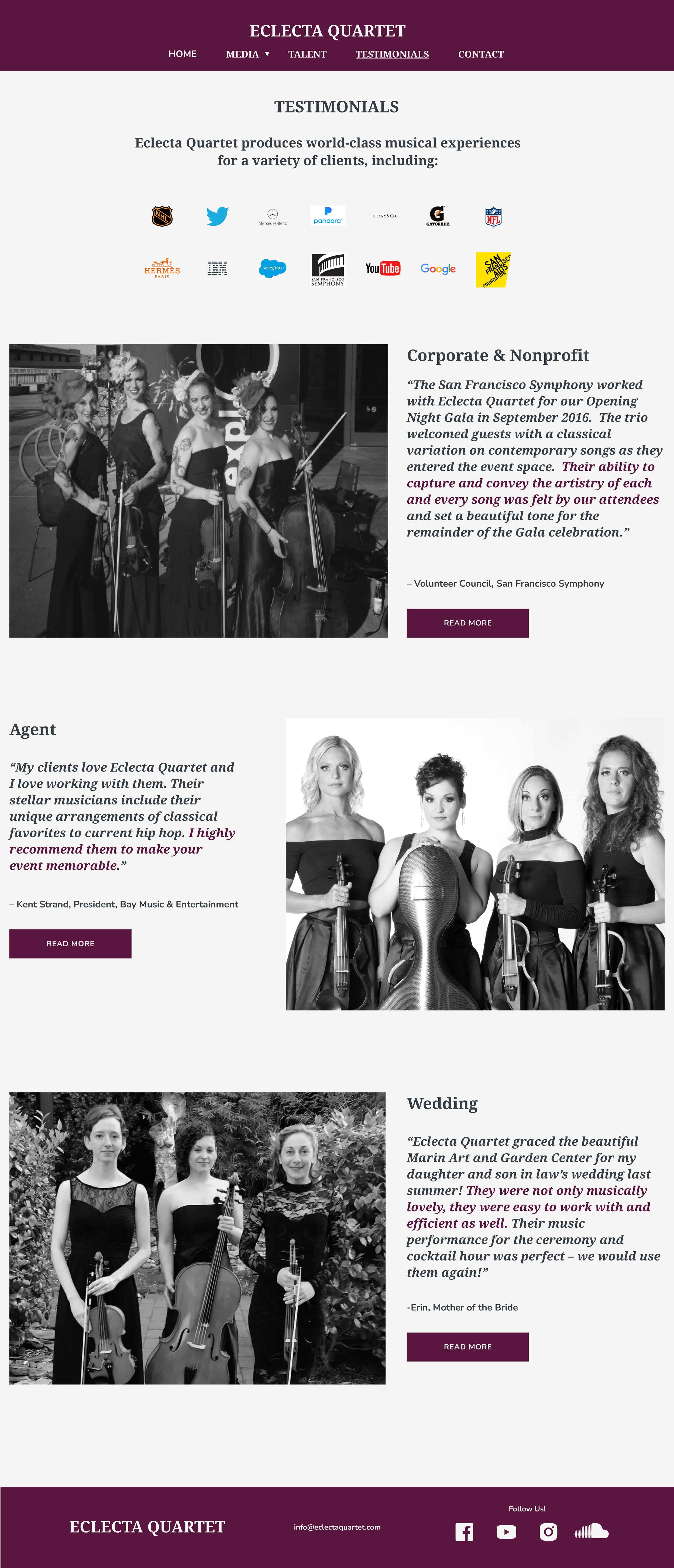
The testimonials page was redesigned to highlight Eclecta’s event versatility and lighten the mental load of the user.

Photos page on mobile.

Photos page on tablet.

Photos page on desktop.
Reflection
Redesigning the Eclecta website was a great way for me to bridge my two worlds of music and design. If I had more time I would have helped Ms. Evoniuk with the art direction of new headshots for the collective in order to create more aesthetic cohesion across the brand. I would also continue to iterate on the submission form, Ms. Evoniuk and I agreed that she could save quite a bit of her own time if we further streamlined the intake form.

Contact form for booking Eclecta Quartet.